Five key tips to make your video call look professional

After more than a year of remote working, most of us probably think we’ve mastered the art of video call. But have we really? A quick glance at the evening news suggests that even seasoned presenters make rooky mistakes when it comes to Zoom and the like.
Here, our expert filmmakers share five key tips to make your video calls and recordings look professional.
Key tips

Sound
The single most important thing for online teaching. Search online for a “USB desktop microphone” or “USB lapel/lavalier mic” – there are plenty of good ones for under £30, and they’ll make a huge difference to your video.

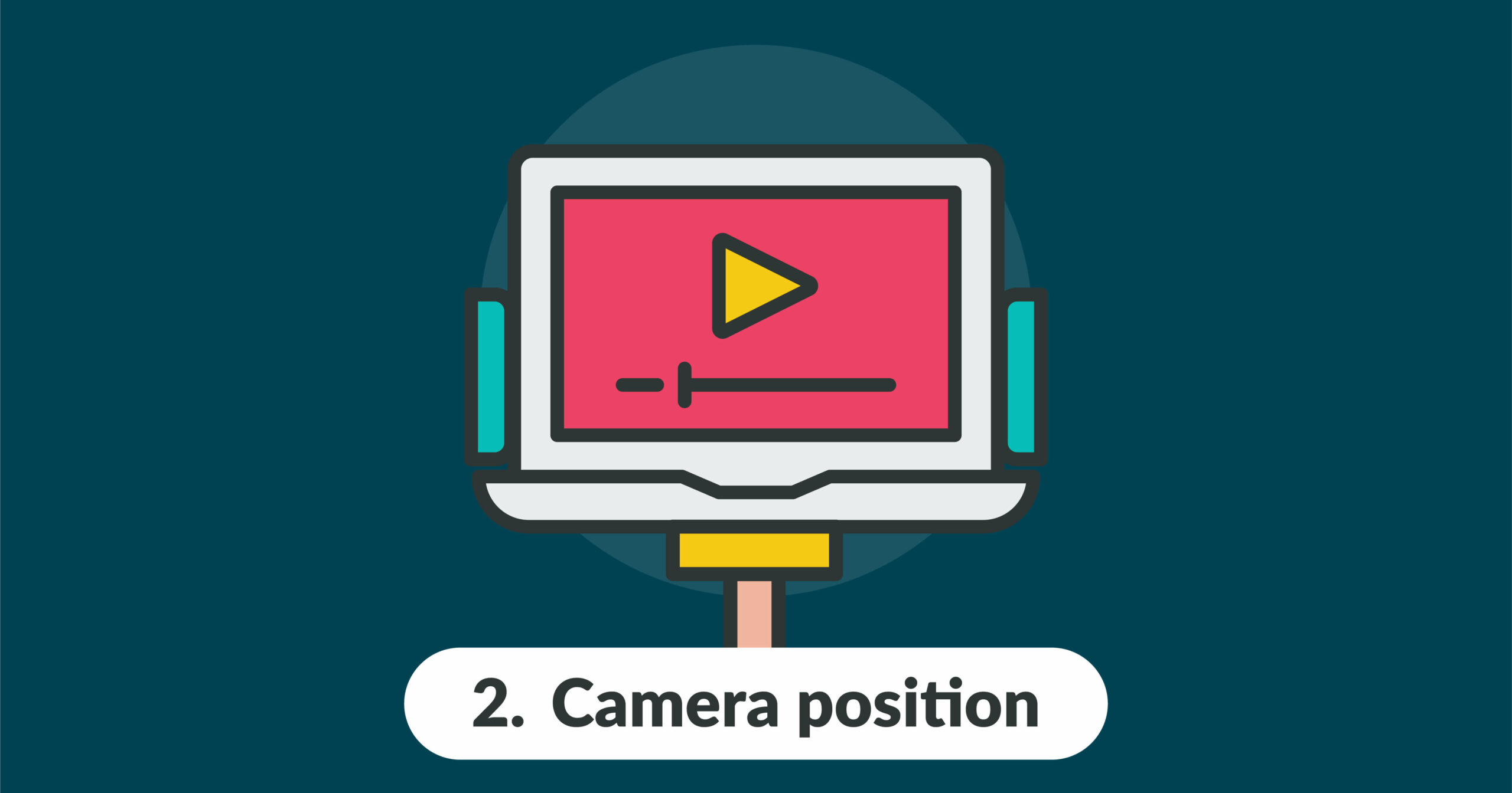
Camera position
The camera should be positioned so the subject is looking straight on, not up or down. Use a stand or books to elevate your laptop or webcam. The subject’s face should be positioned so that their entire head is visible (i.e. do not cut off the scalp or chin), and the eyeline should be between half and two-thirds of the way up the screen.

Camera quality
Ensure your video settings on your preferred video conferencing platform are set to the highest possible levels (usually found on Preferences/Settings > Video). You can even choose to “Touch up your appearance” or “Change background”, depending on the chosen platform.
Important: If you are recording yourself, ensure you pin your video so the feed does not cut between participants.

Lighting
Do not sit with a bright light source (e.g. a window) directly behind you – you will be silhouetted. Instead, you should be lit from front on. For a more interesting look, have one bright light source (e.g. a window) to the front and side of you (two o’clock), and another, slightly dimmer, light source to the front and other side (10 o’clock), or vice versa. Contrast is good, but stark contrast should be avoided; instead, you want graduated contrast.

Background
A neatly composed background makes a big difference. Avoid blank walls, but also avoid clutter, which can be distracting. The more depth (i.e. distance between the subject and the background), the better. Use a few carefully selected props, such as plants, books and ornaments, to improve the aesthetic and provide depth and contrast. These items should be off to the side and as far back as possible – they should never be positioned directly behind the subject, such that they overlap.
If you want to make your videos look more professional, contact us. Studious have a dedicated team of animators, videographers and editors who can take your teaching to the next level. See more of our work here.
Other articles

6th Oct, 2021
Blended learning for languages can boost student engagement
Blended Learning: What Is It? As the name suggests, blended learning blends different learning methods. Essentially, blended learning combines traditional in-classroom teaching/learning with technology-based self-study outside of the classroom. The second part of the blended learning approach, the technology-based e-learning component, can offer real support for language learning. The internet has a wealth of resources, […]

13th Sep, 2021
ESTU + Studious - new partnership!
We are delighted to announce Estu+Studious: a new partnership with ESTU as part of our new corporate services development. Working with Simon Littlewood and Karl Eddy of Estu, Studious will deliver tailored learning solutions available for use in Apprenticeship Levy schemes to major corporations. The content delivered by Studious will be suitable for Learning […]

4th Aug, 2021
Tone of voice: what is yours?
How to use the top brands’ comms tactic to engage students with your online educational content Fast forward to September 2021: after weeks spent preparing classes, creating activities, developing quizzes and choosing case studies, you still have more videos and microphones turned off during your online lecture than you would like. How can […]

